Color as a Point of Contrast
"Likewise color changes meaning from culture to culture. Colors carry different connotations in different societies... To say, however, that color is a shifting phenomenon- both physically and culturally- is not to say that it can't be described or understood." (Pg 81)
Something that has always interested me is using color as a point of contrast in terms of themes. Life as this great and colorful thing, death as darkness and despair. Red means blood and pain, yellow sunshine, and joy. 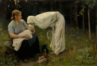 And the thing is it is so hard to challenge the set perceptions of color. It takes work to make that happen in art like graphic design and paintings. The only painting I can think of that really accomplishes this is Janis Rozentals "Doden" (Death) which has Death as a figure in white. He only accomplishes this by diverting every common expectation western society has of death: the victim is a baby, the setting is lush and green, death is a woman, and she has a small sickle, her posture brings her down to the baby's level, she isn't scary so much as peaceful. All of this comes together and the image of Death wearing white seems less absurd.

But when you put themes of life and death next to each other they almost have to revert back to their base designation in order for their meanings to make sense. Which is what inspired the shot I took down below.


I really enjoyed reading your analysis of the painting. Colors really do have designated perceptions but I love when artists successfully challenge those perceptions. It definitely takes a lot of other artistic techniques, as you mentioned, to challenge those themes.
ReplyDelete